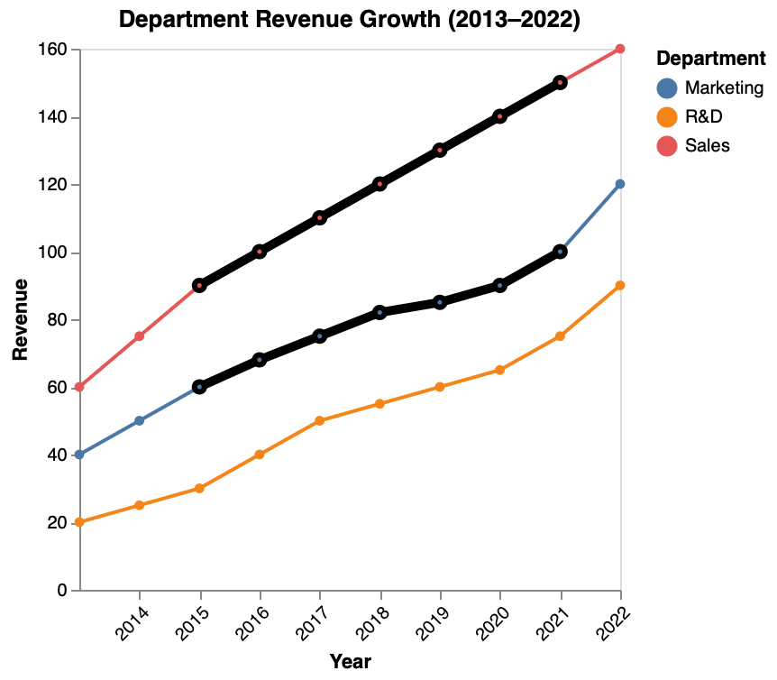
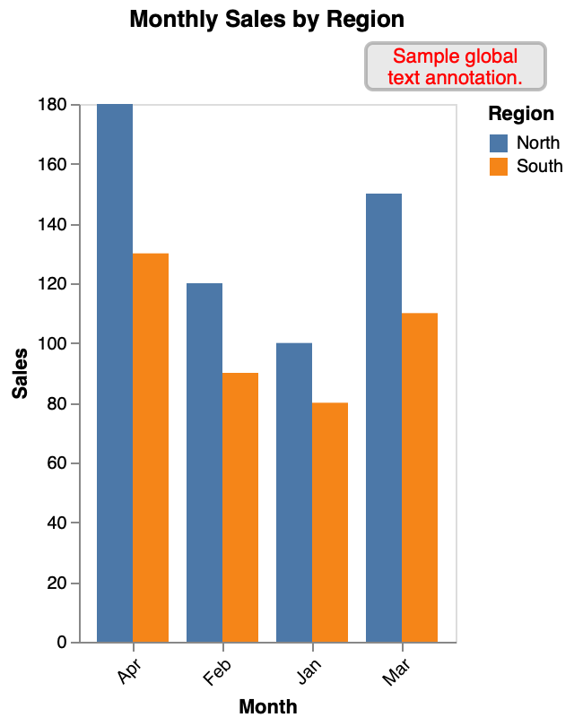
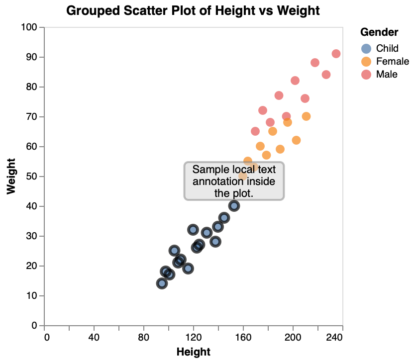
This page shows example specifications for different types of chart annotations.
Here we showcase comprehensive examples that combine multiple annotation techniques to create more sophisticated and informative visualizations. These examples demonstrate how different ChartMark features can work together effectively.
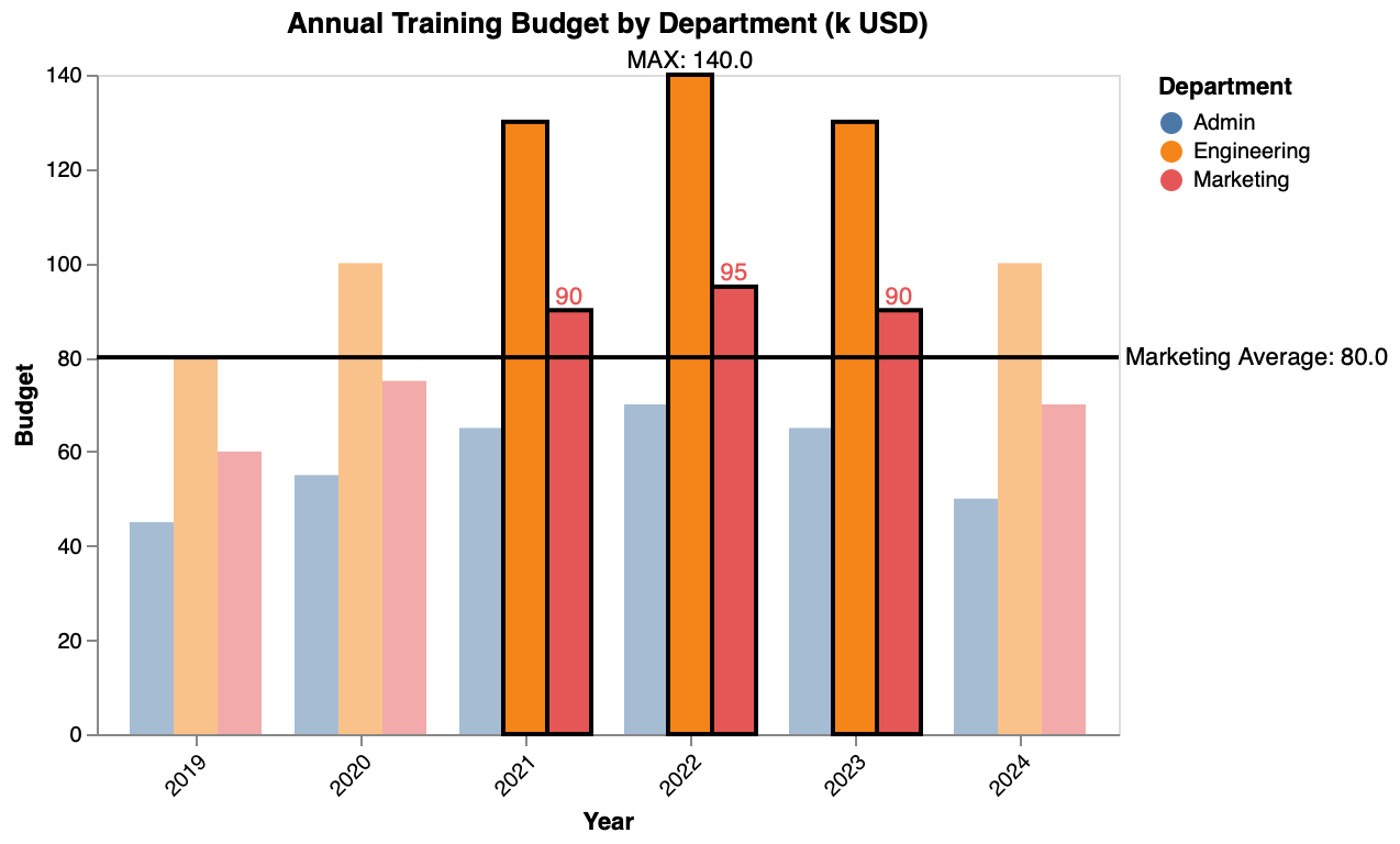
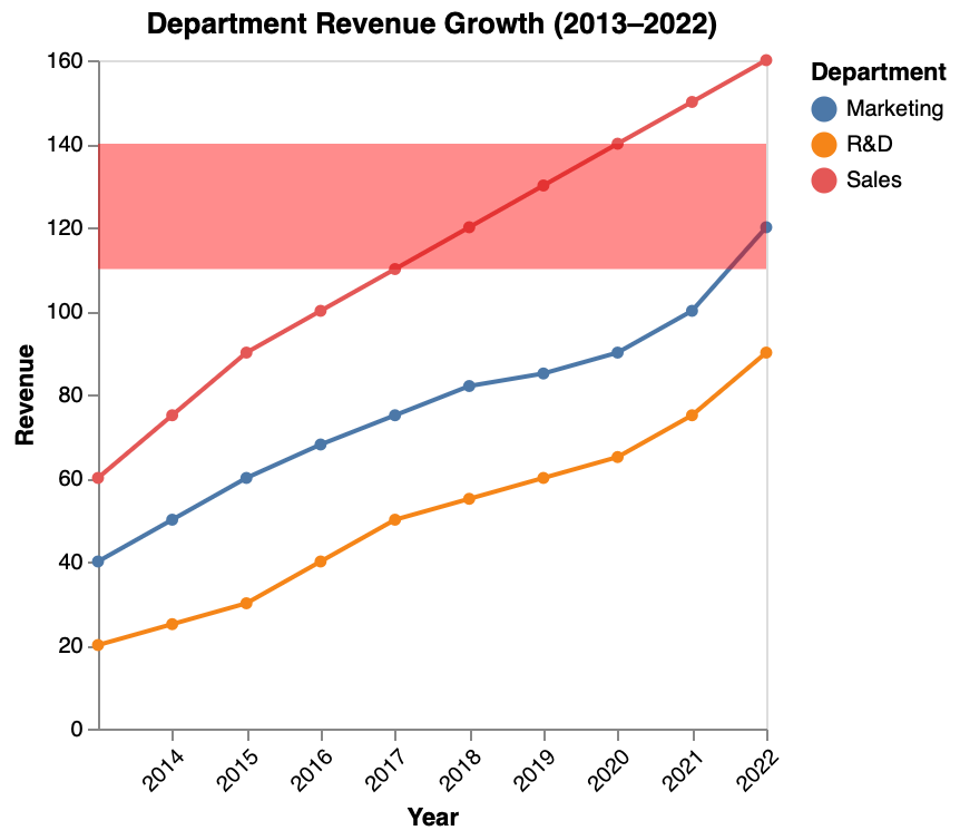
An annual training budget chart combining opacity & stroke highlights on Engineering & Marketing bars (2021–2023), data labels on Marketing values, and a reference line for the Marketing average.
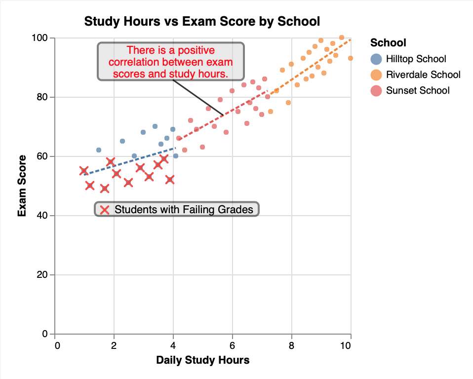
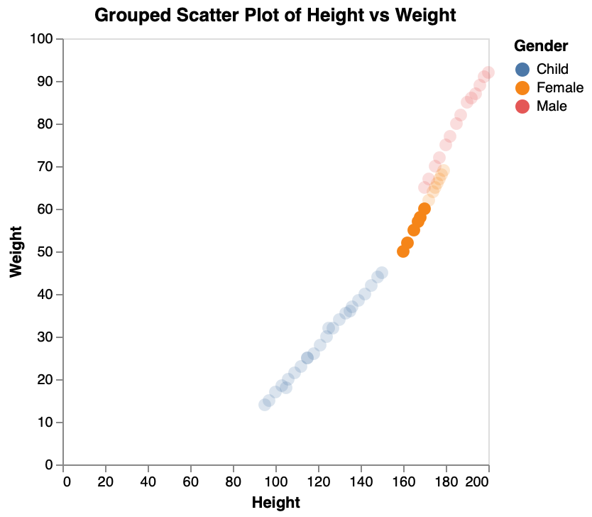
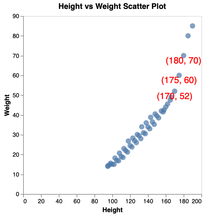
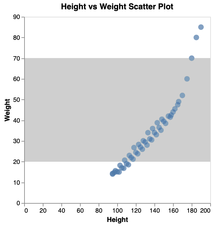
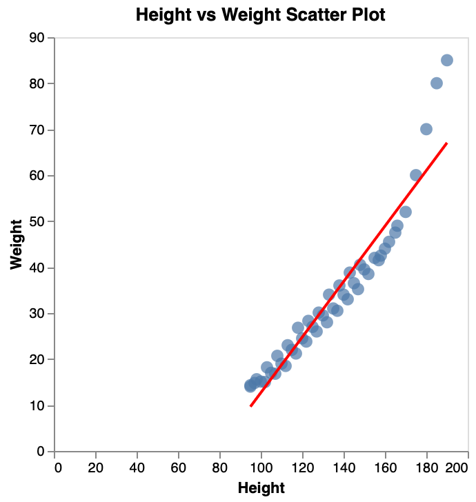
A scatter plot combining regression trend lines, cross-marker highlights for failing students, and a callout annotation to emphasize the positive correlation between study hours and exam scores.
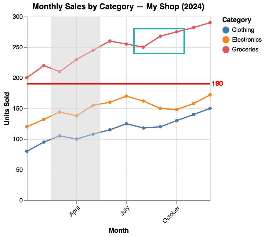
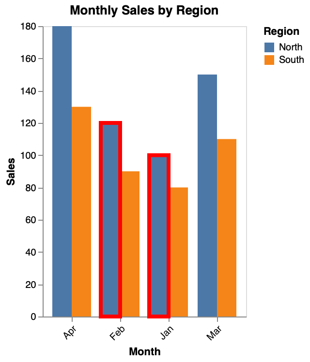
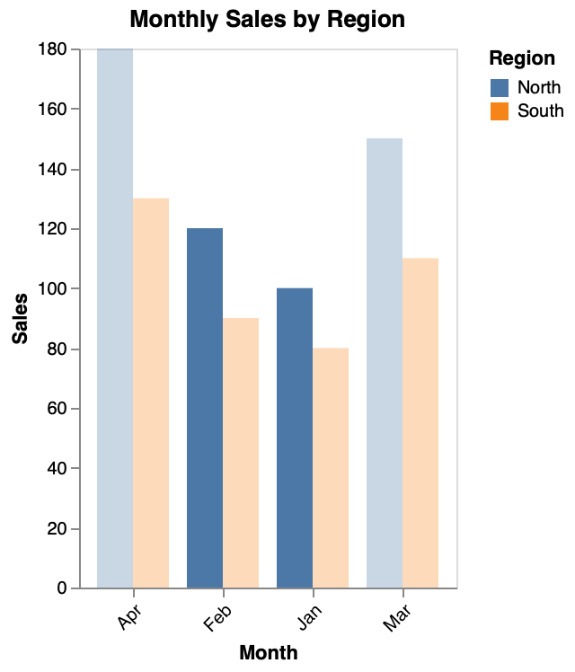
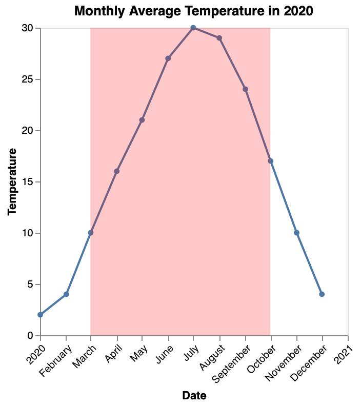
A monthly sales chart combining a shaded Q2 region, a horizontal reference line at 190 units, and a rectangle highlight on Grocery sales growth from July to October.
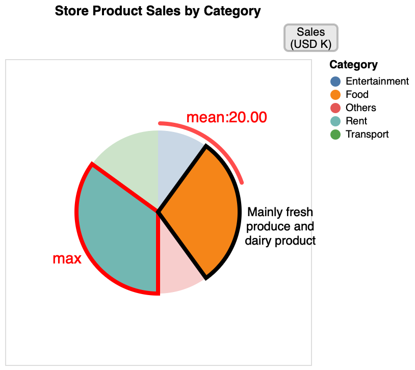
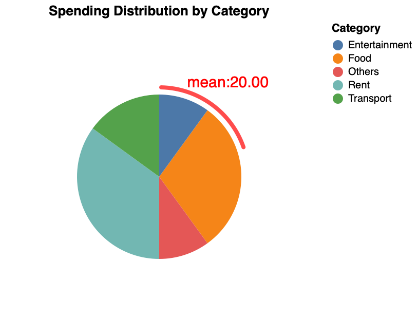
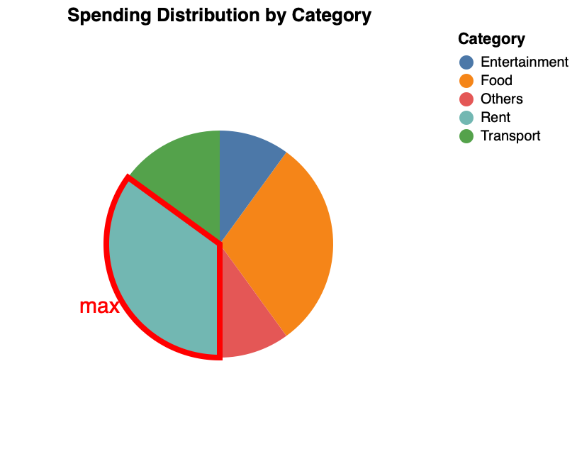
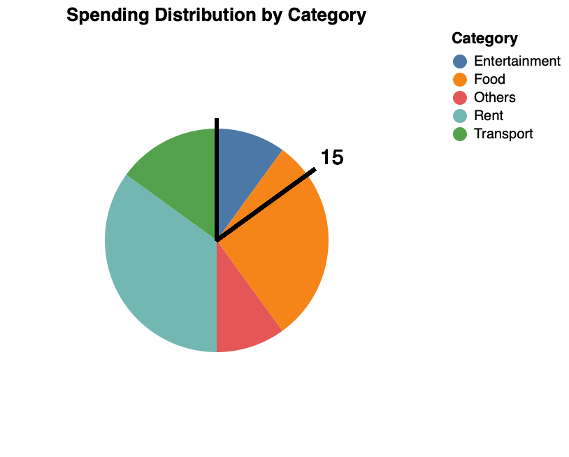
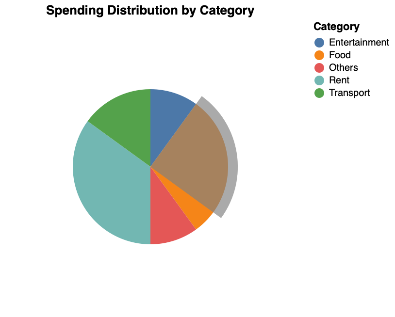
A pie chart combining a highlighted max slice, a mean-value arc annotation, a callout on the food segment, and a units description ("Sales (USD K)").
Highlight specific bars using stroke.
Emphasize line segments with stroke.
Highlight specific points with stroke.
Emphasize pie segments with stroke.
Highlight specific group lines with stroke.
Emphasize grouped scatter points with stroke.
Highlight specific groups with stroke.
Highlight bars by adjusting opacity.
Emphasize lines with opacity adjustments.
Highlight points with opacity variations.
Emphasize pie segments with opacity.
Highlight specific group lines with opacity.
Emphasize grouped scatter points with opacity.
Highlight specific groups with opacity.
Add value labels to bars in a bar chart.
Add value labels to points in a line chart.
Label points in a scatter plot.
Add labels to pie chart segments.
Add labels to grouped line charts.
Label points in grouped scatter plots.
Add value labels to grouped bar charts.
Identify and highlight values in bar charts with labeled lines.
Highlight points in line charts with labeled lines.
Identify values in scatter plots with labeled lines.
Highlight segments in pie charts with labeled lines.
Identify points across grouped lines with labeled lines.
Highlight values in grouped scatter plots with labeled lines.
Identify values in grouped bar charts with labeled lines.
Display max/min values in bar charts with stroked labels.
Highlight max/min values in line charts with stroked labels.
Identify max/min values in scatter plots with stroked labels.
Highlight max/min values in pie charts with stroked labels.
Show max/min values across grouped lines with stroked labels.
Identify max/min values in grouped scatter plots with stroked labels.
Display max/min values in grouped bar charts with stroked labels.
Add global notes to bar charts.
Add explanatory notes to line charts.
Add global notes to scatter plots.
Add explanatory notes to pie charts.
Add global notes to grouped line charts.
Add explanatory notes to grouped scatter plots.
Add global notes to grouped bar charts.
Add local notes to specific bars.
Add local notes to specific points on lines.
Add local notes to specific scatter points.
Add local notes to specific points in grouped lines.
Add local notes to specific group scatter points.
Add local notes to specific bars in grouped charts.
Add local notes to specific bars.
Add local notes to specific points on lines.
Add local notes to specific scatter points.
Add local notes to specific pie segments.
Add local notes to specific points in grouped lines.
Add local notes to specific group scatter points.
Add local notes to specific bars in grouped charts.
Add custom grid lines to bar charts.
Add custom grid lines to line charts.
Add custom grid lines to scatter plots.
Add custom grid lines to pie charts.
Add custom grid lines to grouped line charts.
Add custom grid lines to grouped scatter plots.
Add custom grid lines to grouped bar charts.
Connect related data points with lines in bar charts.
Add connection lines between data points in line charts.
Connect related points with lines in scatter plots.
Connect points across group lines with data lines.
Connect related points in grouped scatter plots.
Connect data points across grouped bar charts.
Add reference lines to indicate important values in bar charts.
Add reference lines to line charts for comparison.
Add reference lines to scatter plots for analysis.
Add reference lines to pie charts for context.
Add threshold lines to grouped line charts.
Add reference lines to grouped scatter plots.
Add reference lines to grouped bar charts.
Highlight specific ranges of values in bar charts.
Visualize value ranges in line charts.
Add range indicators to scatter plots.
Highlight specific range in pie charts.
Add range indicators to grouped line charts.
Visualize target ranges in grouped scatter plots.
Add range indicators to grouped bar charts.
Add shaded areas to line charts.
Add background areas to scatter plots.
Add shaded areas to grouped line charts.
Add background areas to grouped scatter plots.
Add regression lines to time series data.
Add trend lines to scatter plots.
Add regression lines to grouped line data.
Add trend lines to grouped scatter plots.